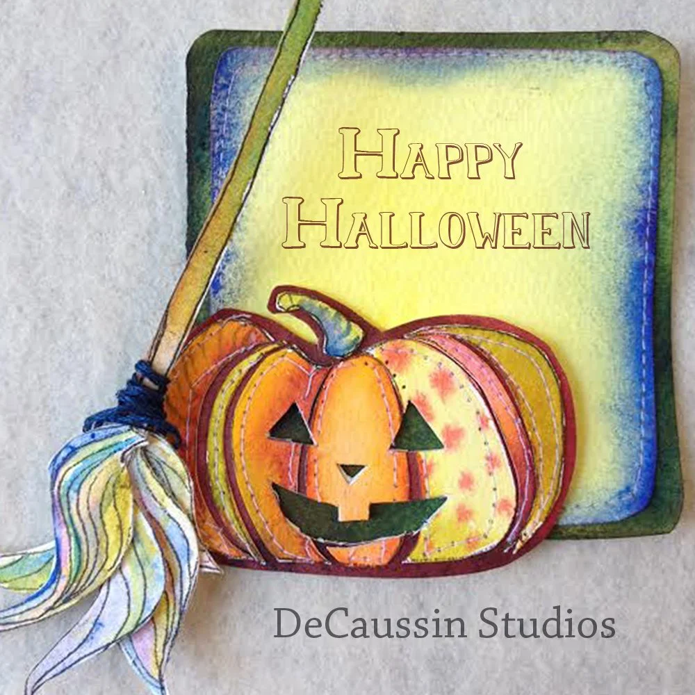
Happy Halloween
Exploring mixed media this season.
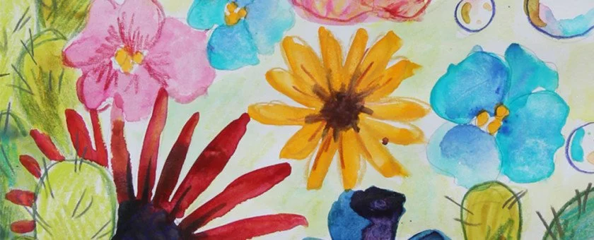
Happy Halloween! I am really excited to do more work like this. I really enjoy incorporating other elements into my watercolor.
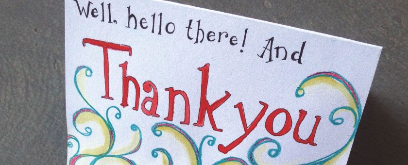
A Thank You Note
Make your curiosity disappear…open here.
My Grandparents sent Cam and I a wonderful card and gift for our wedding anniversary. They are very thoughtful. I love getting mail from my grandparents. I made them this thank you note. I wrote them a private note inside.
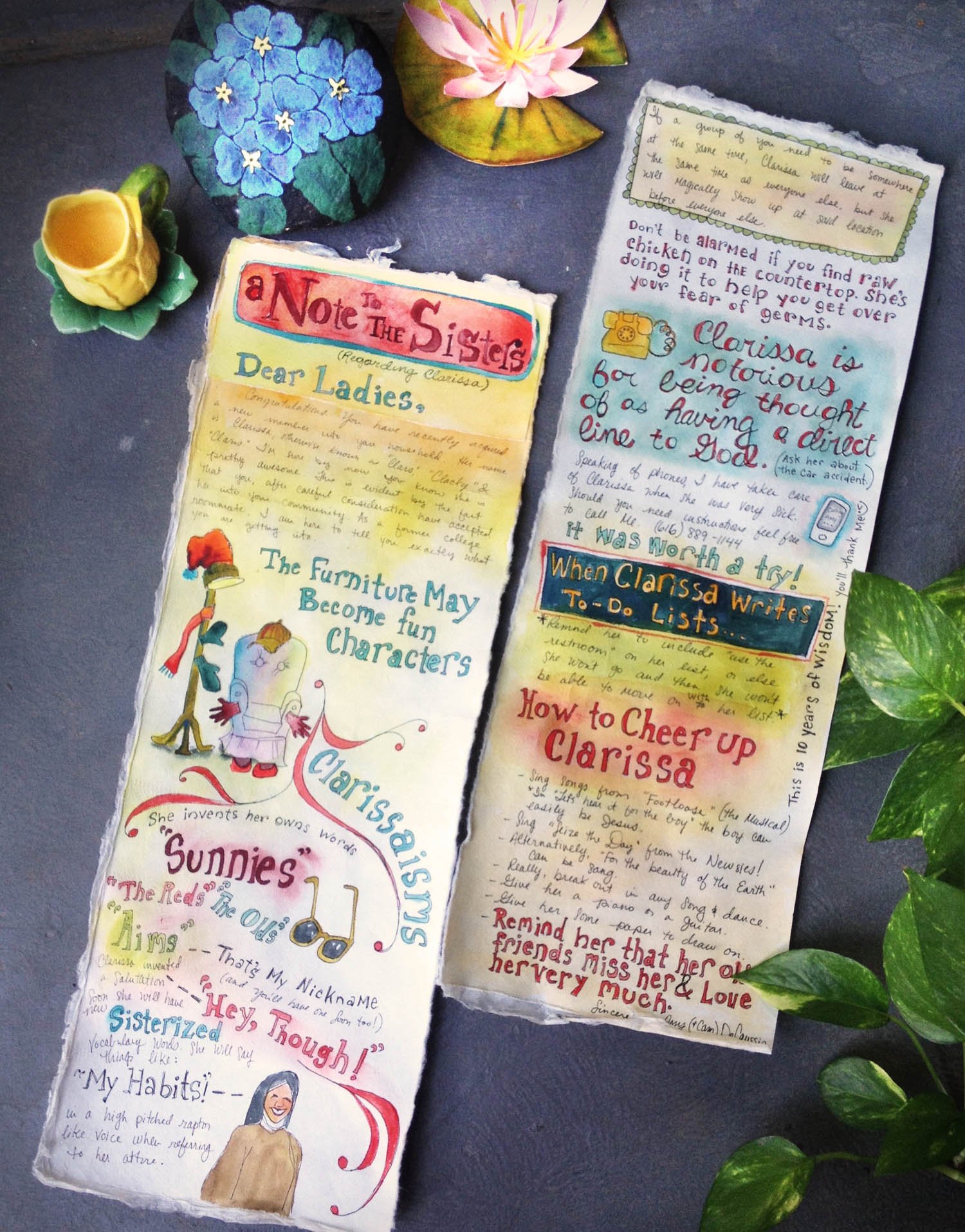
A Letter to the Sisters & Clarissa
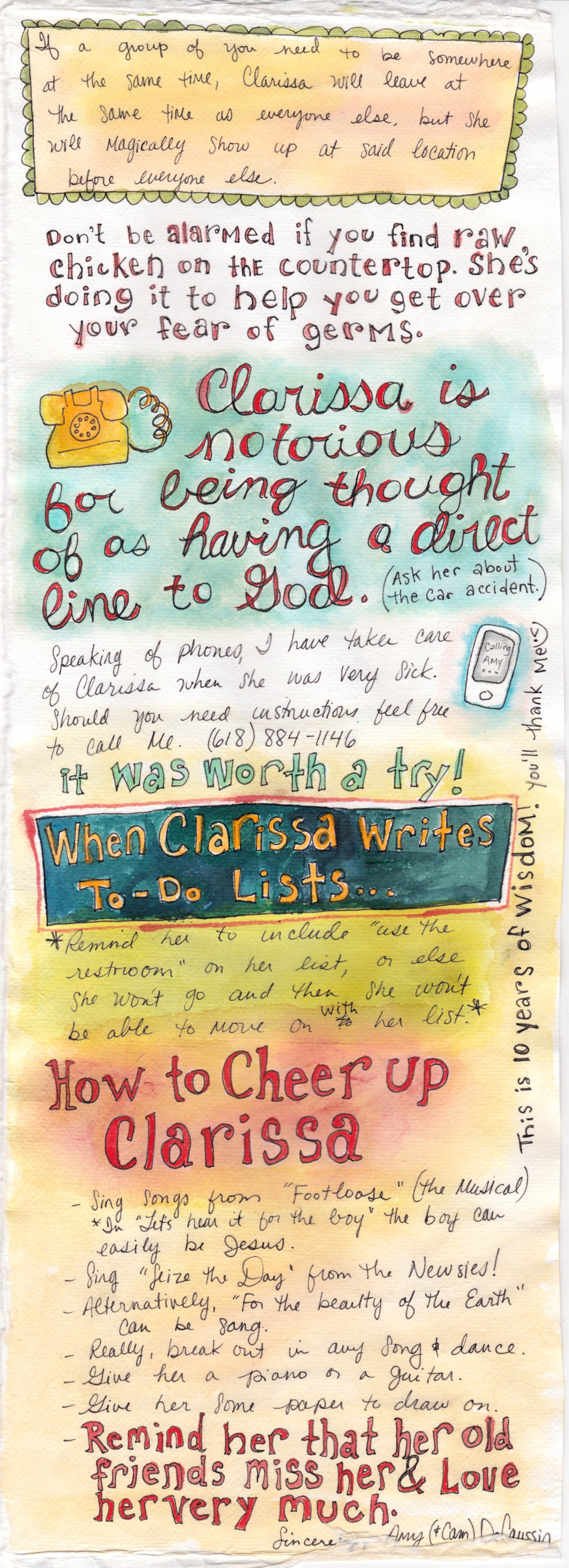
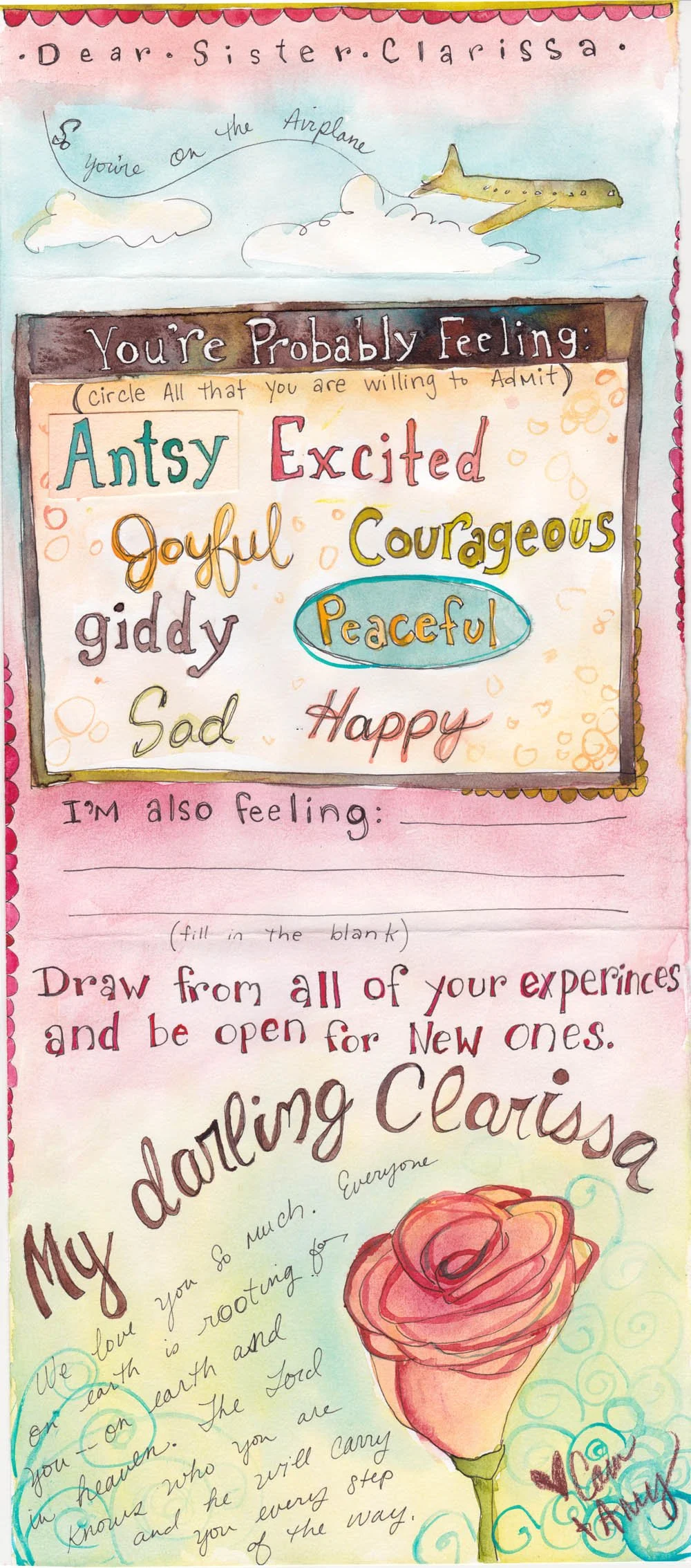
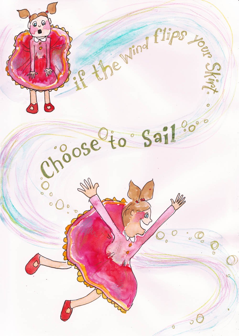
I wrote a letter to the Franciscan Sisters of the Renewal, regarding my best friend, and their new member, Clarissa. Clarissa and I were college roommates for 4 years. Since Clarissa will be potentially living in the Catholic convent for the rest of her life, I thought I could share with them some wisdom about living with her. I found creating this letter to be extremely cathartic. It was a way for me to celebrate all of the time I was so blessed to spend with Clarissa and also to work through all of my feelings during this time of change.
Amy DeCaussin specializes in Illustration. View her work here, amydecaussin.com.
Clarissa’s Flight
After a long time of discernment, my best friend and former college roommate of four years, Clarissa has decided to become a Catholic Nun. This weekend she joined the Franciscan Sisters of the Renewal in Brooklyn, New York.
She will live in community with other Catholic Sisters and devote her life to serving the poor. You can read more about Clarissa’s journey here. Clarissa spent a lot of time over the last years trying to decide if this is what she really wanted to do, however I never realized that it would have such a large impact on my own life. Clarissa and I will never be allowed to catch up on the phone, video chat or email again. The sisters are a “low tech” group. Although, there will be opportunities to visit Clarissa, for the most part, our only form of communication will be through hand written letters. Although this is a large adjustment for me, I look forward to writing some really nice letters, and receiving some as well.
Clarissa and I went to art school together. We walked across the stage with our degrees in art & design, illustration together, and we had our senior thesis gallery show together too. It’s an interesting end to the story of college, since we went in blind with a group of other girls, and in the beginning we did not even have the same major. I could go on and on about Clarissa and all of our fun times. Maybe they will come out in my blog periodically.
I am looking forward to writing and drawing notes to Clarissa to send in the mail. I can’t wait to see what she sends back–as she is a very talented illustrator. These letters will be posted in my “snail mail” category, and are already beginning to serve as a great way for me to challenge myself.
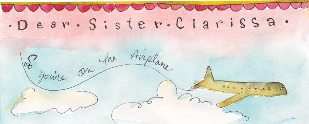
This first piece was sent to Clarissa to open on her flight to her new life in New York City. It is signed at the bottom by my husband Cam and I.
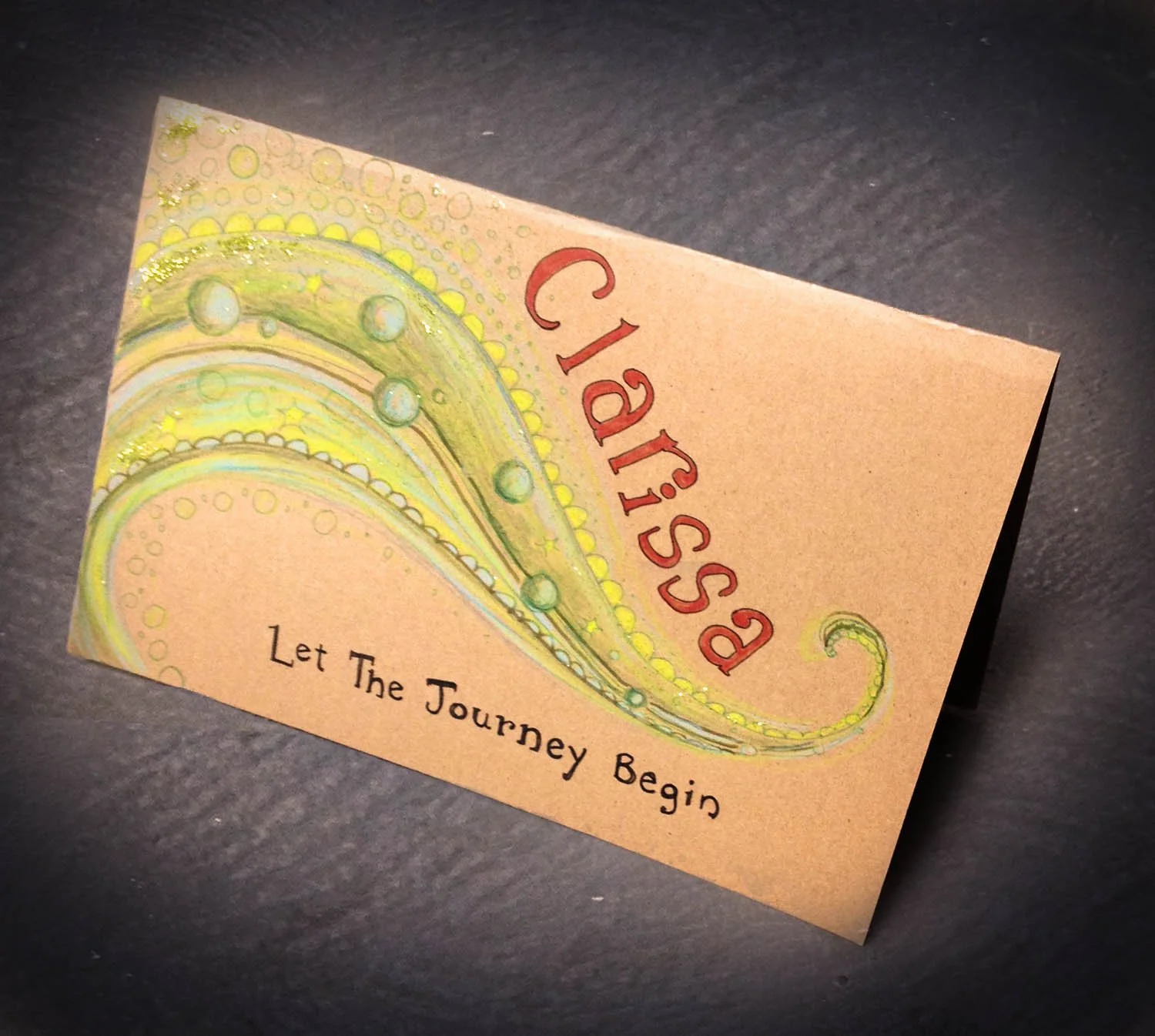
Below is the outside of the envelope I sent the note in.
Amy DeCaussin specializes in illustration and animation. View her work here, amydecaussin.com.
Let the Journey Begin
Another handmade card 🙂 This one is for one of my best friends, Clarissa. My husband Cam and I sent here this card in the mail as she is preparing to enter the Franciscan Sisters of the Renewal–the Catholic convent.
Amy DeCaussin specializes in illustration and animation. View her work here, amydecaussin.com.
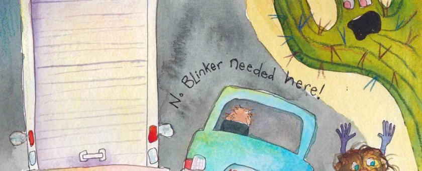
No Blinkers Needed
Phoenix drivers!
ONCE A PHOENICIAN NO BLINKERS ARE NEEDED.
While cruising down the 101
We keep our driving uber fun
And six traffic lanes
is super plain Jane
When you flicker your light
to pass on the right.
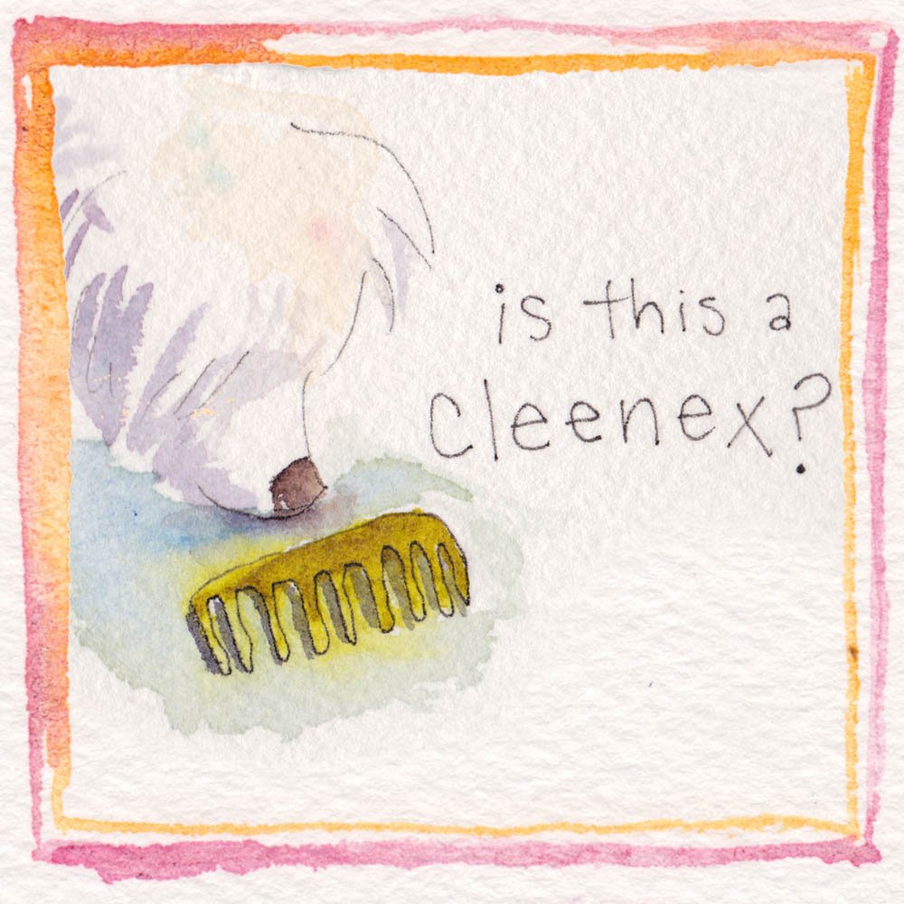
In Search of Cleeeeenex
…a day in the life of Mr. Mikey
I thought I would share a brief sketch of my dog Mikey’s daily routine. He’s been acting out because I’ve been really busy. He is 13 years old but he seems to be reverting back to “puppydom.” Don’t worry, we are taking all sorts of measures to cure his anxiety.
My Paints and Palette
My husband Cam and I were discussing pigment colors and paint over the dinner table. You know, typical married couple chit chat. Cam is an oil painter currently attending Arizona State for his MFA. We must have talked about it for at least half an hour–about the different colors we have tried and how we mix them. We talked about our palettes. I said to Cam, “You know, I work with my palette just about every day, but I never talk about it.” I realized that I have a love affair with my color palette, working closely with it to create my illustrations. I thought I would share some details about what I work with to create my watercolor paintings.
PAINT
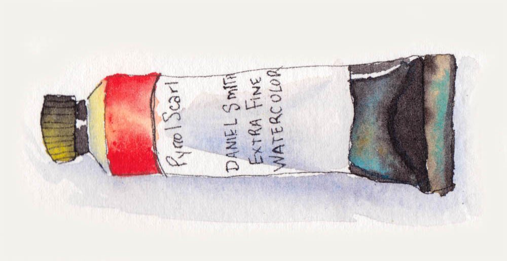
I am brand loyal with my paints, and I mostly use a combination of Winsor Newton and Michael Smith depending on the color. My favorite color is Daniel Smith’s Pyrrol Scarlet. It is very bright. Currently I am using Daniel Smith’s Quinacridone Rose for fuscia and Hansa Yellow Deep as my main yellow, but I’m not too particular about using a consistent hue or brand for them. In fact they can vary quite a bit but that keeps things exciting. I use Daniel Smith Cobalt Blue. You have to be careful not to over mix the blue or it will get muddy very quickly. By itself or mixed lightly with one other color, it is magical. I used to mix Windsor Newton’s Brown Madder with Antwerp Blue to make all my darks. These days I use Daniel Smith Perylene Maroon with the Antwerp because it creates a much richer darks. I also use Winsor Newton Professional Green Gold, Winsor Newton Winsor Green (Blue Shade). I use both Winsor Newton Bismuth Yellow and Winsor Newton Professional Winsor Red sparingly. Red is a very flat color, so a lot of other colors get mixed with it to create dimension. I also use M. Graham & Co. Cobalt Teal. I don’t own a tube of black or white. Straight black is very flat and to lighten color, I just add water.
PALETTE
The palette I use is the one I got in Intro to Watercolor in college. It folds up nicely for storage or travel. I am starting to wonder if I should get a larger palette, since I don’t have room for all of my pigments in the little slots anymore. I was thinking recently that I should clean my palette. This is something I probably do no more than once a year. I always have a spot of mixed paint in the center where I make my dark pigments. In one of the slots there is a random blue that varies from random tubes. I never remember what paint is actually in that slot and I don’t use it very often. I don’t have a whole lot of explanation beyond that for it.
BRUSHES
I am not a brush snob. I like to go to different craft stores when there is a sale and get a cheap pack of multitple sized brushes. I only use round brushes and I don’t like them to be too absorbent or it won’t release the water and paint onto the paper. I also stock up on nicer quality fine tips when one of the local art shops is having a sale. I keep my brushes in a rotating wire container that was meant for cutlery.
OTHER SUPPLIES
I use a mason jar for water and I keep my paints in one of those plastic pencil boxes that kids use in grade school. I also use facial tissue. When people watch me paint, they often think that I must have made a mistake when I grab a tissue. This could not be further from the truth. Using tissue is all part of the process of creating watercolor…at least it is for me.
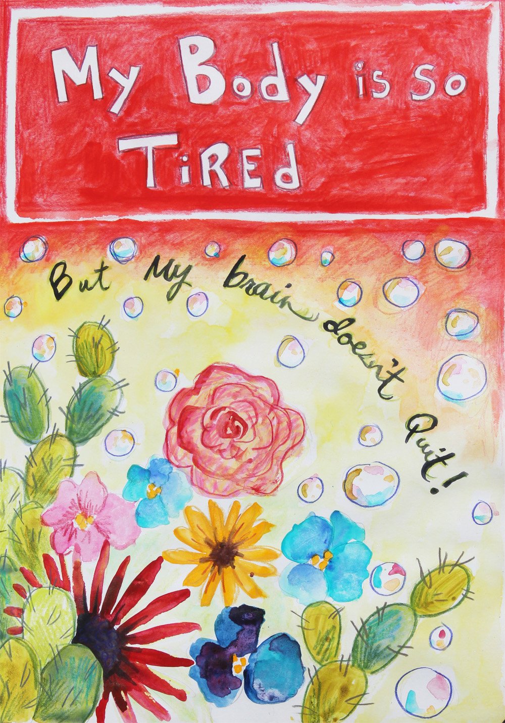
Body Tired-Brain Not Tired
I’m just getting around to posting this journal entry. I painted this after a long week full of events and when I finally got a chance to sit down, I was inspired, but my body was exhausted. I guess I was too tired to work on some serious illustration projects, but not too tired to do completely nothing.
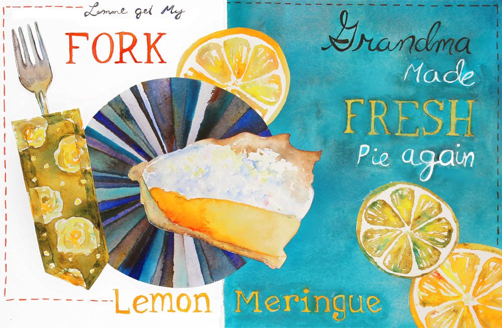
Lemme Get My Fork
Grandma made fresh lemon meringue pie again!
My grandparents spend their winters in Florida. Visitors and neighbors are notorious for requesting Grandma’s lemon meringue pie for events and gatherings. To make her pie, Grandma walks across the street in their retirement park to the neighbor’s house where she picks fresh lemons off of their tree. When the pie is finished it is amazing. My experiences spent at Grandpa and Grandma’s house in Florida are surreal, magical and very special.
These illustrations are watercolor collaged on illustration board.
Torch Age
**Warning: Profanity is used in this post**
I finished another piece in my “Snail Mail” series. It is another birthday card, as someone close to me had a birthday this weekend. Not all of my snail mail will be for birthdays, or even for special occasions. The person that I created this for was not particularly excited about their birthday, so this design seemed fitting.
I painted watercolor onto watercolor paper and cut them out. I played around with their placement before gluing them down for the final collaged composition.
The base of the card was once again, (like the last card I made for my Grandpa) made out of junk mail cut up and glued together. I really enjoy the tactile feel of the layers of paper, as well as the hint of “homemade” style it gives it. To me it is a way of expressing thoughtfulness. The time I spent making this card was time I spent thinking about this person. I’m not usually a huge fan of profanity, but I wasn’t so sure that this is even considered offensive, and, well it seemed fitting. My apologies if anyone is offended. I really enjoy a little snarkiness.
I had a lot of fun decorating the envelope using prisma colored pencils and some brand new micron pens.
I had a lot of fun making this card. Stay tuned for more “Snail Mail” 🙂
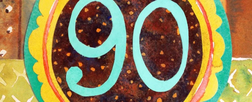
Snail Mail - Grandpa’s 90th Birthday
I am starting a new series in my blog called “Snail Mail.” I will be posting about different handmade cards and stationary projects that I will be sending to people who are very special to me. This series serves several purposes. It allows me to express love towards people who I care about deeply. It also serves as a wonderful place of inspiration for illustration. This project definitely embodied that and I had a lot of fun doing it.
Today is my Grandpa’s 90th birthday! We currently live far away from my grandparents, so I am unable to celebrate with him. I wanted to send him a special card.
The base of the card is made completely from upcycled materials. I took some junk mail and cut it to size.
On the inside of the card, I covered up miscellaneous words with the interior design of an envelope and an excerpt from the church bulletin taken from this past Easter Vigil service. The dismissal music seemed fitting to my Grandpa’s personality as he can be a bit rebellious.
On the inside, I wrote a personal note to my Grandpa from my husband Cam and I.
And I wrote a little note on the back too…
Since the card was made entirely from scratch, I did not have an envelope to match, so I made the envelope out of another page from the church bulletin.
The front of the card design was first sketched out in my sketchbook. There, I played around with the color composition using colored pencils. For the final piece, I painted different layers of watercolor paper and collaged them together.
From the different patterns, I also created a bolt fabric design sample to put in my portfolio.
This was a really fun project and I can’t wait to create more “Snail Mail!” I hope that my Grandpa enjoys his card and that he has the happiest of 90th birthdays. Check out the invitation I designed for my Grandparent’s 65th Wedding Anniversary Party.
Background floral pattern featured in these photos is designed by Silvia Dekker published in Flow Magazine’s “Book for Paper Lovers,” given to me by Illustrator Rebecca Green.
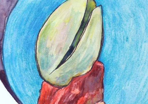
Pistachio Peak
When you misread the sign…
My husband Cam and I took a weekend off and drove from our home in Phoenix, Arizona down to visit some relatives in Tucson. It is about a two hour drive and, being new to Arizona, we had never been there. On our drive down there was a very large peak that began to grow larger and larger in our view as we approached it along the highway. I looked at the map. “That mountain up ahead is ‘Pistachio Peak.'” I told Cam. I studied the peak and thought it over in my head. It made perfect sense somehow. I imagined a large pistachio nestled into the crescent wedge shape at the top. As we got closer, Cam pointed to a sign, “Did you mean ‘Picacho Peak?'” he chuckled. I had completely misread what the map said and never thought twice about it. Something that we continued to laugh about for a long time after.
There is a state park that the mountain sits in and there are trails to hike. We did not stop to explore the landscape there, but now it is on our to-do list. I have been really enjoying exploring Arizona. I have been hiking a lot and enjoying the mountains, which are very accessible, even in the 6th largest city in the country (Phoenix). I am extremely passionate about nature. If you feel the same way, like if you are super geeky about it like I am, I recommend checking out a documentary series called “The National Parks: America’s Best Idea.” It is a PBS series, but I found it on Netflix. This series has greatly effected me. It has awakened the previously existing deep passion inside of me for all of God’s creation.
Creative Cleanse
I spent the better part of today on the phone with the insurance company trying to resolve some issues. Eventually I did reach a real human on the other end that could be of some assistance. By the time things were resolved, I had binged on all the brownies that we brought home from our weekend trip to Tucson.
My solution to this very frustrating day is a variation of what healthy people often do. Healthy people say “I’m going on a cleanse.” Yes folks, I am going on a cleanse, however not your typical cleanse like drinking juice for meals. I wipe the rest of my day of phone calls with “representatives” and policy talk. I am done for the day with bill paying and the feeling of defeat. I am going on a creative cleanse. For the rest of the day I will be sitting in my studio gingerly painting while binge watching movies like “Little Women.” I will be stopping only to maybe do the dishes, take my dog for a walk and possibly binge on more dessert food with my husband.
A Day of Dual Events
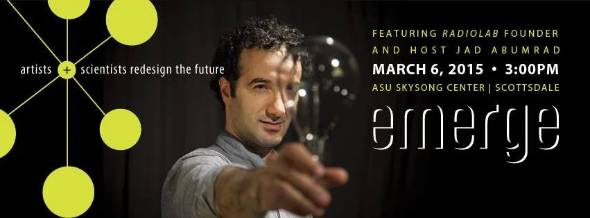
Whereas my husband Cam and I often enjoy working closely together on our creative ventures, next Friday, March 6th, we both have big events happening on opposite sides of the city. If you are in the Phoenix area next weekend, I encourage you to go for a drive and check them out. If you are not in the area, you can read about the ‘goings on’ here.
In Scottsdale I will be at ASU’s event Emerge at Skysong Center. It is a “festival of artistic and scientific visitations of the future.” The whole event runs from 3pm – 12am and is free and open to the public. The event is featuring NPR’s Radiolab founder and host, Jad Abumradwho will be on the outdoor stage at 7:00pm.
In this project I am working as the Production Manager for the Set Design Team. We have been hard at work creating a blank canvas for all of the performance and interactive teams we call “visitations.” Each team will have a designated space on our “set” to present their projects in. Our design team includes Stage Manager Cooper Sanghyun Yoo, Lighting Designers Hailey Featherstone and Jamie Arakas as well as Projection Designer Ian Shelanskey, Set Designer Mahya Najafianrazavi, Technical Designer Michael Blaney, Technical Director Max Evjen and our Co Director Megan Halpern. It has been fun to take a different seat in the creative process. I have enjoyed the collaboration as well as working more closely in the field of performance art.
On the other side of town, as part of the “Art Detour” weekend, {9} The Gallery will be hosting the artwork of seven Master of Fine Art Painting students from Arizona State University. My husband Cam DeCaussin will be one of the featured artists. The reception for the show will be on Friday at 6pm. Cam will have several oil paintings in the show. This event is also free, but the work will be for sale.
The show will also feature the work of Travis Ivey, Swapna Das, Joe Holdren, AJ Nafziger, Rory Alan MacLean, & Lisa Hoffner.
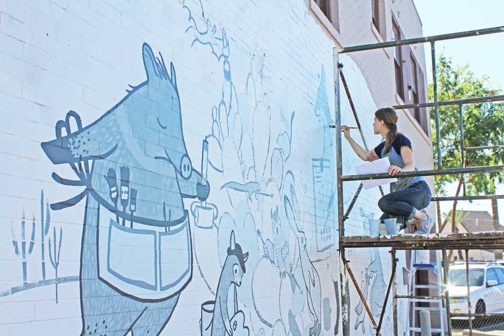
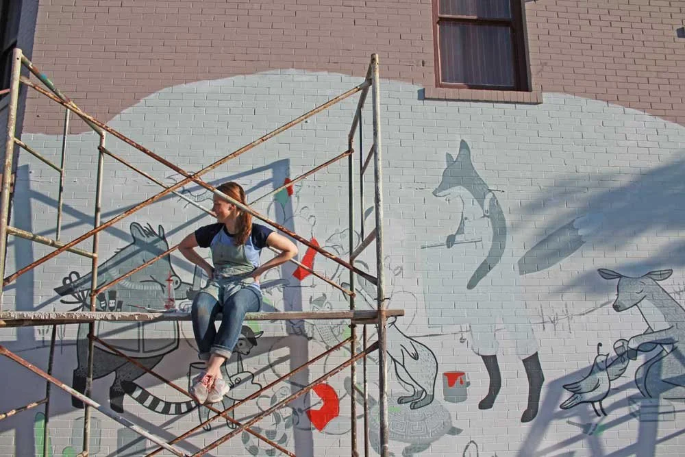
If you take a walk next door to the gallery, you will find “The Lodge Art Studio” where the closing reception for “Being Human” will be taking place. On the outside of the building, you will be able to spot the freshly painted mural by Rebecca Green that I recently assisted with. You can read my blog post about that project here as well as Becca’s blog post, and the Phoenix New Times article too.
For more information about each event click the links in this post. You can also check out Emerge on Facebook & Twitter as well as the Facebook Event Page for 7 @ 9
The Painted Desert with Rebecca Green
Lessons in color from renowned illustrator, Rebecca Green.
Last week I had the privilege of working with illustrator Rebecca Green on her mural project “The Painted Desert.” She flew in from Denver, Colorado to sunny Phoenix, Arizona for the occasion. Painting a mural is a large project to tackle and takes several days to finish so Becca had a team of creative folks helping her along the way.
On the first night Becca took her final sketch and projected it onto the side of the building, The Lodge Studio, where Becca used to work when she lived in Phoenix. There was a little bit of chaos moving the bulky projector around to get it placed just right. It sort of ended up in the street. Studio mates Abbey Messmer and Rafael Navarro were there to assist as well. Once in place, we used thin brushes to apply the outlines of the sketch to the wall.
As I said before, the process took several days. I was not able to be there to help Becca the whole time, but when I was it was really fun.
I learned a lot about color. Becca used a limited color palette. The first layer was monochromatic and she added bright colors over it to accent the whole piece. Choosing the colors was an experiment. The time of day effected how the colors looked with the direction of the sun. The colors needed to be mixed just right so that they all married well together in the composition.
Becca said that she was afraid of using bright colors and I laughed because I have always struggled using muted colors. I am learning that muted colors are very important to composition. They help balance the color composition. I am learning that they are not as boring as I used to think because they make brighter colors look their best. Together they can create magic.
We went out for a drive in the warm sun and chatting it up and losing ourselves in great conversation as we made pit stops for paint and supplies. When it was time to paint, I really enjoyed standing on the scaffolding barefoot painting in the afternoon sun. We talked about art and life and everything in between. Although Becca and I are only about a month apart in age, and we both grew up in Michigan, we have had very different experiences in our lives that have brought us to where we are today.
The mural is now complete and it looks beautiful. It has been a pleasure to assist Becca with this. I will smile every time I drive by “The Painted Desert” mural at The Lodge studio.
Snail Mail
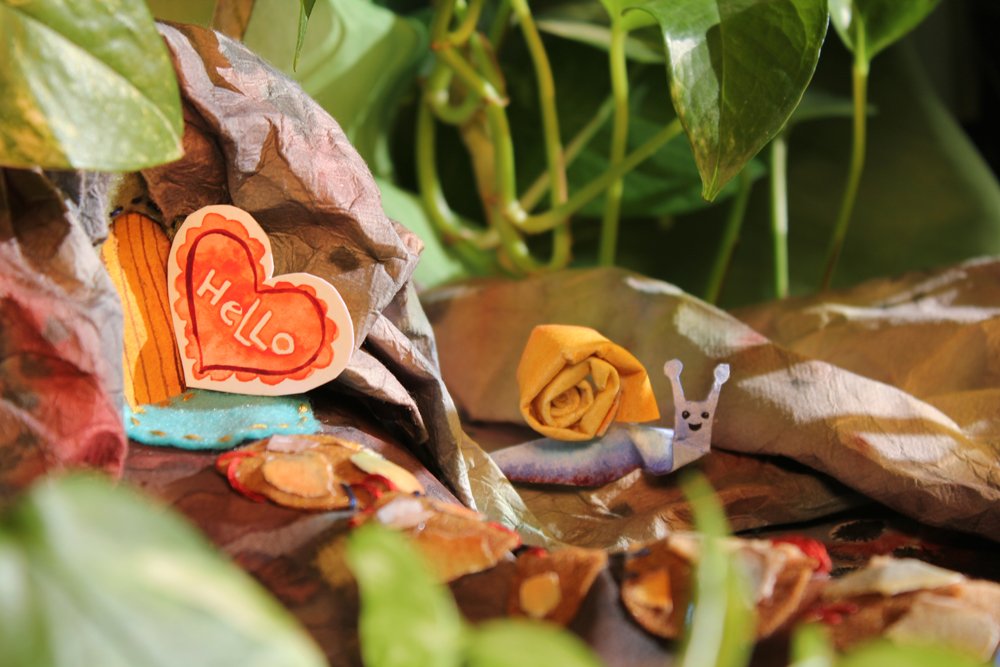
Snail decided to make some lovely cards for his pals for Valentine’s Day. He got himself into some sticky situations, but he had a fun little adventure delivering his notes to them.
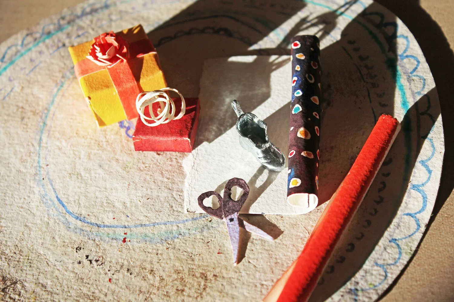
Who doesn’t love getting thoughtful cards in the mail? This series of illustrations highlights the joy of receiving handmade paper gifts in the mail as a way to love those around you. I decided to breath life into my watercolor by bringing it into a new dimension. This was an exploration into a new world of imagination. I really enjoyed moving my work in this direction.
http://www.amydecaussin.com
Phoenix New Times - Rebecca Green
I had a wonderful time painting alongside Rebecca Green, assisting with her mural in Phoenix. You can read the full article here as well as my own blog post about it here.
A Christmas Scene
Illustration Diorama
This is a three dimensional Christmas scene made entirely out of paper, india ink and watercolor with the exception of a game piece.
